Tourism Website Design: What Every Tour and Experience Page Should Include
On this page 9 sections
Key takeaways
- Put price, duration and next available dates near the top of every experience page
- Use a scannable inclusions list so guests know exactly what is covered
- Show a step-by-step itinerary to build confidence before checkout
- Place verified reviews close to the booking button to handle objections
- Display your cancellation and rescheduling policy beside the price, not buried in terms
- Design and test the booking flow on mobile first, not as an afterthought
Your experience page is not a brochure, it's a sales engine. Tour operators and activity businesses that fill their pages with high-quality itinerary details, honest inclusions and exclusions, real reviews, clear pricing and a friction-free booking path convert more of the visitors who arrive ready to book. With visitor demand holding strong and 78% of Australians now relying on digital tools to plan trips, the structure of your individual tour and experience pages will make or break your conversion rate.
Why your experience page is your most important sales tool
Visitor demand is strong but pages must convert it
Australia received 703,480 short-term visitor arrivals in September 2026, up 1% year on year, according to ABS short-term visitor arrivals data, September 2026. That's consistent demand, but the visitors arriving are comparison shopping. They are on your experience page because they are seriously considering a booking, not just browsing inspiration. Your page needs to answer their questions and remove their objections right there, before they click away to a competitor.
Digital planning drives booking decisions in 2027
Booking.com research released in October 2026 found that 78% of Australian respondents say digital technology makes travel planning easier. That means your experience page carries the full weight of the booking decision. Visitors expect to find dates, availability, itinerary, what's included, reviews, FAQs and a booking button on the same page. If they have to hunt across tabs or dig through your site to understand what they're paying for, they'll leave. Turning visitors into bookings starts with removing every friction point from the experience page itself.
What to put above the fold on a tour page
Experience name, location and duration
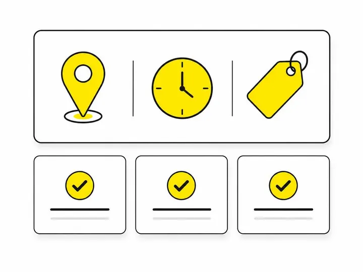
Your headline should answer the most basic question: what am I buying, where, and how long will it take? "Sydney Harbour kayak tour" is clear. "An unforgettable paddling adventure" is not. Lead with the experience name, the location (or the starting point), and the total duration in hours or days. This goes in your first heading and near your booking button.
Price and next available dates
Show your per-person price clearly. If your price varies by group size, age or season, list the most common option above the fold and explain variations below. Display the next three to five available dates, not a calendar picker that requires extra clicks. Research shows that visible availability removes a major objection: "Can I actually book when I want to go?" If you offer a date that is 45 days away, say so. Transparency builds confidence.
Your primary booking action
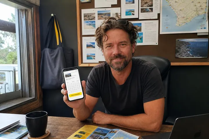
Place a single, prominent booking button above the fold. Use plain language: "Check availability", "Book now" or "Select a date". Keep it in view as visitors scroll down the page, especially on mobile. Mobile-friendly website design means your booking button stays visible when someone reads your itinerary on their phone.
Inclusions, exclusions and what guests must bring
Make inclusions scannable, not buried in paragraphs
Use a bulleted list. Tell visitors exactly what is included: guide, transport, equipment, meals, entry fees, photos or certificates. Be specific. Instead of "meals included", write "Morning tea and packed lunch included". Instead of "equipment", list "Helmet, life jacket, paddle and dry bag provided". Visitors are mentally pricing your experience against others; a scannable inclusions list wins that comparison. Place this section early, before the detailed itinerary.
Be upfront about exclusions and guest responsibilities
Tell people what they must pay for, bring or arrange themselves: travel to the meeting point, alcohol, gratuities, travel insurance, specific clothing or medications. If your tour is not suitable for young children, early pregnancy or certain physical conditions, state it clearly. This honesty reduces no-shows and pre-booking questions. It also protects your business by setting clear expectations.
Turn your itinerary into a confidence builder
Time-based or step-by-step format
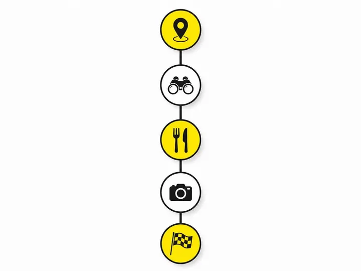
Show your itinerary as a timeline or sequence. Start with the meeting point and time, then describe what happens next in short, clear sentences. Example: "9:00 AM: Meet your guide at Circular Quay North. 9:15 AM: Safety briefing and equipment fitting. 9:30 AM: Paddle departure. 11:00 AM: Rest stop at Cockatoo Island. 12:30 PM: Return to Quay." This format lets visitors imagine their day. It answers the unspoken question: "What will I actually be doing?"
Meeting point details and what to expect on the day
Include a postcode, a street address, landmarks and parking details. If your meeting point is hard to find, link to a Google Map or describe it from the nearest train station. Tell visitors what to wear, what the weather is likely to be, what fitness level is required and whether the terrain is flat, steep or water-based. If your tour is cancelled in rain, say so and explain the reschedule policy. If it goes ahead only on calm days, explain how notice is given. This detail moves hesitant visitors toward booking.
Using reviews where they do the most work
Place testimonials close to the booking button
Reviews are trust signals, and trust happens near the moment of purchase. Place a selection of recent, verified reviews just above or alongside your booking button. If you gather reviews on Google Business Profile or TripAdvisor, embed or quote the best ones directly on your experience page. A five-star review saying "Best day of our trip" matters far more if it appears when someone is deciding to click "Book", not when they're reading about your company history.
Feature feedback that answers real objections
Choose reviews that address the concerns first-time bookers have. Look for feedback about guide expertise, safety, organisation, suitability for families, value for money or how well the experience matched its description. Avoid vague praise. A review saying "Our guide Sarah was incredibly knowledgeable and kept us safe. We felt relaxed the whole time" is more convincing than "Great tour". How to ask customers for Google reviews shows you how to gather specific feedback you can display on your pages.
Operational FAQs that answer objections before checkout
What to cover in your FAQ section
An operational FAQ is not marketing; it is reassurance. Cover these topics: What happens if the weather is bad? How much notice is given for cancellation? Can I reschedule to another date? How do I receive my booking confirmation? Can I bring young children, pets or mobility aids? What is your refund policy? Can I take photos? Do you provide food or drinks? What if I arrive late? Is transport included or how do I get there? Recent Australian research shows that 89% of holidaymakers prefer to reschedule rather than cancel. Display your cancellation and rescheduling policy beside your price, not hidden in terms and conditions. This transparency removes anxiety and reduces pre-booking emails.
Designing for mobile booking first
Keep the booking button always visible
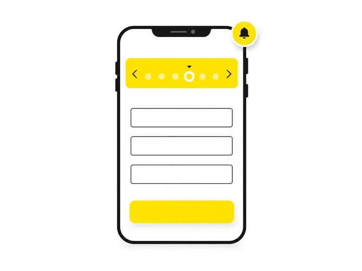
On mobile, your booking button should stay in view or easily accessible via a sticky button at the bottom of the screen. Test your page on an iPhone and Android phone. Scroll through your itinerary and FAQ. If your button disappears or requires scrolling past three sections to reach it, you've lost mobile visitors. Structuring your website for results means putting your call to action where people expect to find it, especially on small screens.
Minimise form fields and confirm instantly
When someone clicks "Book", ask for the minimum: date, group size, name, email and payment details. Some booking systems support instant confirmation; if yours does, show it. A message like "Booking confirmed. Check your email in 2 minutes" is far more reassuring than "Your request has been sent to our team. We will contact you within 24 hours." Instant booking confirmation is now standard in the market, and Australian travel businesses offering it see higher conversion rates.
Serving international visitors on your experience pages
Directions, meeting points and transport options
International visitors may not know Sydney's suburbs or bus routes. Describe your meeting point in plain English with a postcode, street address and landmark. Link to Google Maps. Explain how to get there by public transport, car or taxi. If you offer hotel pickup, state it clearly and charge for it transparently. Use Australian time zones (AEDT, AEST) and explain what time the experience starts and finishes in both 24-hour and 12-hour format.
Accessibility, language and payment information
State whether your experience is wheelchair accessible or suitable for people with mobility limitations. If you offer guides or materials in languages other than English, say so. Search visibility for tour operators improves when your pages serve both domestic and international search intent clearly. Confirm which payment methods you accept (credit cards, PayPal, Apple Pay) and whether you support international credit cards. Tourism website packages that include booking system integration ensure you can collect payment securely from visitors anywhere in the world.
Conclusion
Your experience page is not a marketing brochure; it is a decision support tool. Every section, from price and availability at the top to FAQs and reviews before checkout, serves one purpose: to move a interested visitor from "I'm thinking about this" to "I'm booking this now." When you make inclusions, exclusions, itinerary, reviews, policies and booking actions transparent and scannable, you remove friction and reduce pre-booking questions. You also build trust, which matters especially for first-time customers choosing between your business and a competitor's.
The data supports this approach. Visitor demand is steady, digital planning is now the norm, and 89% of Australians prefer flexible rescheduling options. Tour operators who make cancellation, rescheduling and weather policies visible alongside price will see fewer complaints and higher booking confidence. Mobile-first design is no longer optional; it is the baseline. Test your experience pages on a phone, keep your booking button always visible, and confirm bookings instantly if your system allows it.
Start by auditing your current experience pages against this list. If your itinerary is buried, your inclusions are vague, your reviews are nowhere near your booking button, or your FAQ is missing, those are your first priorities. Even small tourism businesses can compete on experience page design; it costs nothing to reorganise your content, add a sticky booking button or move your best reviews closer to the top. The payoff is fewer objections, faster bookings and a clearer understanding of what drives your business.