Website Header Design for Australian Small Businesses: What Should Go Above the Fold?
On this page 11 sections
Key takeaways
- Lead with a specific value proposition, not a vague slogan
- Show one primary CTA; make secondary links visually smaller
- Use only one or two trust signals above the fold
- Hero images are a performance risk: compress or replace with CSS
- Design for mobile first; thumb-friendly buttons are non-negotiable
- WCAG 2.2 Level AA contrast applies to text over hero images
Your website header is the first thing every visitor sees, and for many it is the only thing they see before deciding whether to stay or hit the back button. Getting your website header design right is one of the cheapest, highest-impact improvements an Australian small business can make, whether you run a café, a physio clinic, an accounting practice or an online store.
This guide covers what belongs above the fold, what doesn't, and how to keep your header fast and accessible in 2026. If you are rethinking your whole homepage, pair it with our guide to the best website layout for small businesses in Australia.
Why does your website header matter so much?
Your header matters because it is where visitors decide, within a few seconds, whether your business can help them.
What "above the fold" actually means in 2027
Above the fold is whatever appears on screen before someone scrolls. In 2027 that usually means a phone screen, so your fold is much smaller than it looks on your office monitor.
Why visitors decide to stay or leave within seconds
People arrive with a question: do you offer what I need, near me, and how do I get it? If the header answers those quickly, they keep reading. If it shows a vague slogan and a slow-loading photo, they go back to Google and click your competitor.
What must go above the fold on a small business website?
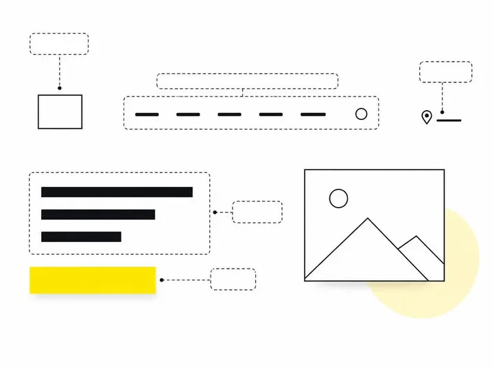
Every small business header needs five things above the fold: your name, a specific value proposition, your location or service area, one primary call to action and simple navigation.
1. Your logo or business name
Keep it clear and reasonably sized. It confirms people are in the right place, but it shouldn't dominate the screen.
2. A specific value proposition (not a tagline)
One plain sentence saying what you do and who for. More on this below.
3. Service area or location
"Bookkeeping for Parramatta businesses" beats "Bookkeeping services". Online stores can swap location for "Australian owned, shipped from Melbourne".
4. One primary call to action
A single, obvious button for the main thing you want visitors to do.
5. Navigation that doesn't overwhelm mobile users
Four to six top-level menu items is plenty. Everything else can live in the footer or on service pages.
How do you write a value proposition that beats a tagline?
A strong value proposition states who you help, what you provide and where you operate, in one sentence a stranger understands immediately.
Replace vague slogans with who, what and where
"Quality you can trust" or "Passion meets excellence" could belong to any business on earth. Ask yourself what a customer would type into Google, then say that, plus the outcome they care about.
Examples for different Australian business types
Physio clinic: "Sports and back pain physio in Newcastle, with same-week appointments."
Accountant: "Tax and BAS for sole traders and small companies across Brisbane."
Café: "Specialty coffee and all-day breakfast in Fremantle, open from 6:30am."
Online retailer: "Australian-made linen bedding, free shipping over $150."
Which call to action should your header use?
Your header should use the one call to action (CTA) that matches how your customers actually buy from you.
Match the CTA to how your customers buy
A dentist should push "Book online". A boutique law firm might use "Request a consultation". A café is better served by "View menu" or "Find us". If most of your enquiries come by phone, a tap-to-call button is the right primary action. Our guide on how to get more quote requests from your website goes deeper on wording.
One primary action, one secondary action
Make the primary button bold and high contrast. A secondary option such as "View services" can sit beside it as a plainer text link or outline button. Three or four equal-weight buttons simply split attention.
Trust signals above the fold: less is more
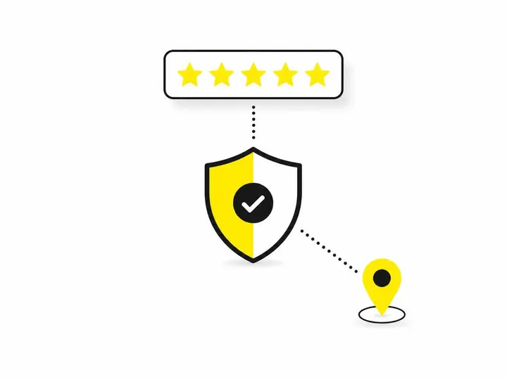
One or two strong trust signals in your header build confidence; a wall of badges undermines it.
What counts as a high-value trust signal
A Google review rating with the number of reviews
Years serving your local area
A professional registration or accreditation (CPA, AHPRA, and so on)
A clear guarantee or response time promise
The mistake of stacking too many badges
Six logos, a rotating testimonial and a "100% satisfaction" seal crowd out your message and slow the page. Pick your most convincing signal and move the rest further down.
How do hero images affect page speed in Australia?
Large hero images and video backgrounds are often the slowest element on the page, and most Australian small business sites are already failing on speed.
What the 2026 Lighthouse data says about Australian sites
The Pryce Digital 2026 Australian website audit tested 12,621 small business sites with Google Lighthouse. Only 11.7% met the 2.5 second Largest Contentful Paint (LCP) target on mobile, and 27.3% scored below 50 overall. LCP measures how long the biggest visible element takes to appear, which is usually your hero image. You can read Google's explanation of Largest Contentful Paint and how it is measured for the technical detail.
Meanwhile, ABS website data shows only 55.1% of employing Australian businesses had their own website or app in the year to June 2025. Having a fast, clear site is still a genuine edge.
Practical rules for a fast, good-looking header
Resize hero images to the size actually displayed and compress them (WebP or AVIF).
Skip autoplay video unless it truly shows something a photo can't.
Limit sliders, animations and third-party scripts in the header.
Test on mobile in Lighthouse before and after every change.
What changes in mobile-first header design?
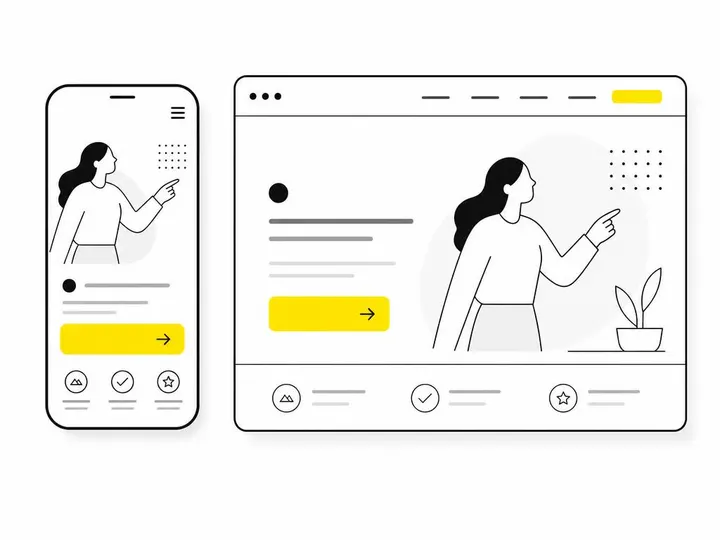
Mobile-first design means building the header for a small screen and a thumb first, then expanding it for desktop.
Compact layout and thumb-friendly buttons
Keep the header bar slim so your value proposition and CTA fit on the first screen. Buttons should be large enough to tap easily, with space around them, and nothing should force sideways scrolling. Our guide to making your website mobile-friendly covers the rest of the page.
Hamburger menus and what not to hide
A hamburger menu is fine for secondary pages, but never hide your phone number, booking button or core message inside it.
What accessibility rules apply to your header in 2027?
WCAG 2.2 Level AA is the practical benchmark for Australian business websites, and your header is where many failures happen.
Private businesses aren't bound to one named standard, but WCAG is the reference point when disability discrimination complaints are assessed. With about one in five Australians living with a disability, it also makes commercial sense. See the accessibility standards for small business websites for a fuller picture.
Colour contrast over hero images
White text over a busy photo often fails contrast checks. Add a dark overlay or place text on a solid panel.
Keyboard navigation, focus states and meaningful labels
Menus and buttons must work with a keyboard and show a visible focus outline. Labels like "Book a consultation" beat "Click here", and your logo needs proper alt text.
Common header mistakes Australian small businesses make
The most common mistakes are vagueness, clutter and slowness.
Slogans that don't say what you do
No location or service area
Several competing buttons
Auto-rotating sliders that bury the message
Oversized hero images dragging down LCP
Phone number hidden on mobile
A quick header audit checklist
Open your site on your phone and check:
Can a stranger tell what you do and where within five seconds?
Is there one clear primary CTA?
Is there at least one credible trust signal?
Does mobile LCP come in under 2.5 seconds?
Is text readable over any image?
Does everything work with a keyboard?
Conclusion
A good small business header is simple: your name, a specific value proposition, your location, one primary call to action, light navigation and a single strong trust signal. Keep the hero image lean, design for mobile first, and build towards WCAG 2.2 Level AA so every visitor can use it.
If a rebuild makes more sense than patching, our small business website packages include header design as standard. Either way, start today by running your homepage through the checklist above on your own phone and fixing the first thing that fails.