Restaurant Website Design: How to Turn Menu Browsers Into Bookings
On this page 8 sections
Key takeaways
- Publish your menu as real HTML text, not a PDF or image
- Put a Book a Table button in the header and repeat it after the menu
- Show address, phone and hours without any scrolling on mobile
- Use consistent dietary labels so allergy concerns do not kill bookings
- Test your whole booking path on a real phone on mobile data
Your restaurant website is not a brochure. It's a booking tool and a menu browser that diners use to make a decision in the final minutes before they book a table or walk in the door. If your menu is buried in a PDF, your booking button is hard to find, or your opening hours aren't visible without scrolling on a phone, you're losing customers to restaurants that make those details effortless. The difference between a website that converts and one that doesn't comes down to how well you answer the questions diners are actually asking.
Why Your Website Is a Booking Tool, Not a Digital Brochure
Seventy-two percent of diners check a restaurant website before visiting for a sit-down meal, and 80 percent say the menu is the main reason they visit the site, according to Owner.com's 2026 survey of 1,300 restaurant guests. That's not the behaviour of someone casually browsing. That's someone in the decision phase, looking for a reason to book or a reason to choose somewhere else.
Your website needs to answer the questions that happen in that moment: Do you have a table available? Can I see what you're serving? Do you cater to my dietary needs? Where are you, and how do I get there? How do I book? Every element on your site should be designed around removing friction from that decision.
What diners actually do before they visit
Before diners land on your website, they've already decided they're interested. They're searching for your restaurant by name, or they've found you through a Google search for "restaurants near me" or "cafes in [suburb]". They want confirmation that you're open, that the food suits them, and that they can reserve a table without hassle. Seventy-five percent expect to browse the menu online and 84 percent look at dish photos before deciding what to order. If those aren't available, or if they're hard to find, the diner moves to the next restaurant.
How Google's AI Mode is changing restaurant discovery in 2027
Google has expanded its AI Mode restaurant booking into Australia, using live availability from reservation platforms and restaurant websites to complete bookings before sending customers to partners. This means your website data now feeds into Google's AI-led discovery system. If your menu is out of date, your opening hours are wrong, your booking link is broken, or your dietary labels are missing, you're invisible to an AI assistant helping a diner decide where to eat.
This shift makes local SEO visibility dependent on the cleanliness and accuracy of the information on your actual site. Your menu, hours, address, phone number and booking availability are now machine-readable data that Google's AI uses to answer customer questions in real time.
Your Menu Is a Conversion Page. Treat It Like One
Your menu is not a decorative element on your website. It's the page where a diner decides whether to book. If it's hard to read, slow to load, impossible to search or buried in a PDF, you've already lost the conversion.
HTML text versus PDF menus: why the format matters
HTML menus, where the text is published directly on your website, are faster to load, searchable by browser, accessible to screen readers, and visible to Google's AI systems. PDFs are not. A recent audit of 52 independent restaurant websites found that only 44 percent displayed menu content as real website text, while 35 percent used only a PDF or photo for the menu. That means 56 percent of restaurants are making their menu invisible to search and AI discovery, and harder to use on mobile.
Your menu should be published as HTML text on your website. A PDF version is fine to offer as a downloadable backup for customers who want to print it or email it, but it should never be your primary menu. If your website builder or CMS doesn't make it easy to add menu items as text with prices and descriptions, that's a sign you may need help from a restaurant website design service that knows how to structure menus for both human diners and search engines.
Dish photos, prices and descriptions that build appetite
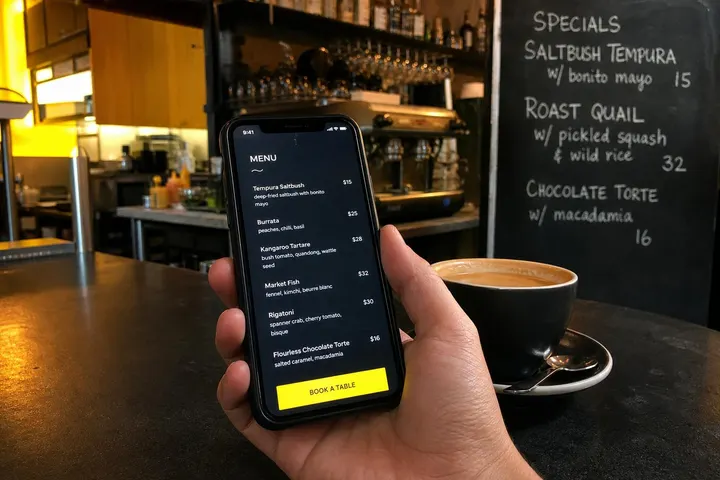
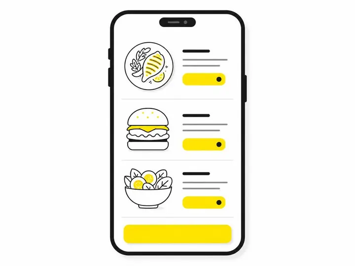
Include a photo of each dish or at least the most popular items. Price every item clearly. Write short descriptions that explain what the dish is and what makes it special. "Roast chicken with burnt orange and sage" tells a diner more than "Chicken (G, N)" and gives them confidence in what they're ordering. Keep descriptions to one or two sentences.
How to structure menu categories for fast scanning
Group dishes into clear categories: starters, mains, sides, desserts, drinks, coffee. Use a simple, single-column layout on mobile that lets diners scroll vertically through the list without hunting. Avoid hiding menus behind tabs, accordions or lightbox popups unless your menu is very long. Make the structure obvious so a diner can find what they're looking for in under five seconds.
Dietary Information: The Detail That Removes Hesitation
A diner with a vegetarian diet, a nut allergy or gluten intolerance needs to know immediately whether your restaurant can serve them safely. If they can't find that information quickly, they'll book somewhere else.
Using consistent labels for vegetarian, vegan, gluten-free and allergens
Label every menu item with clear, consistent symbols or text tags: V for vegetarian, VG for vegan, GF for gluten-free, N for nuts, S for shellfish, etc. Use the same labels throughout the entire menu so diners learn them in seconds. Place the legend at the top of your menu and repeat it at the bottom if your menu is long.
For items that might contain traces of allergens even if they're not a main ingredient, be explicit. A gluten-free dish cooked in a shared fryer or a vegan dish that shares prep space with eggs should be labelled clearly so diners can make an informed choice.
Handling serious allergy enquiries responsibly
Include a note on your menu that explains how customers should handle serious allergies. Something like: "Please inform your server of any allergies. While we take allergy management seriously, we cannot guarantee zero cross-contamination in our kitchen." This puts responsibility where it belongs and protects your business while being honest with customers.
Design the Booking Path Around How Diners Actually Decide
The moment a diner finishes reading your menu and thinks "yes, I want to eat here," they should be able to book a table with three taps. Every unnecessary step between that decision and a confirmed booking is a reason for them to change their mind.
Where to place the Book a Table button
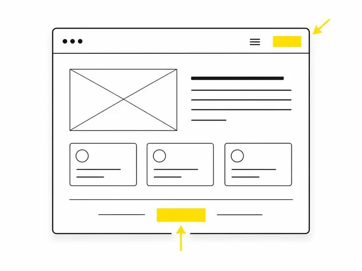
Your "Book a table" button should appear in the header or navigation bar at the top of every page, in a contrasting colour that stands out. It should appear again immediately after your menu, and once more beside your address and contact details. A diner should never have to hunt for how to make a reservation.
Embedding your booking system versus linking to it
If your booking system allows embedding, embed it directly on your website so a diner can book without leaving your site. If not, link directly to your booking platform so they can complete a reservation without passing through an intermediary page. Keep the booking path as short as possible. Smooth, consistent conversion rate optimisation for small business websites starts with removing barriers between intent and action.
Keeping your booking platform and website consistent
Check that the menu, prices, opening hours, dietary labels and contact information on your website match exactly what's in your booking system. If a diner sees different opening hours in your booking platform than on your website, they'll lose trust. If the menu prices don't match, they'll be confused or annoyed. Audit both systems weekly and make updates in both places at the same time.
Location Details That Remove Every Reason Not to Come
Seventy percent of diners who abandon a restaurant website say a poor design makes them less likely to order. A significant part of that poor design is location information that's hidden or hard to find. A diner should never have to dig for your address, phone number, opening hours or directions to your car park.
What contact information to show above the fold on mobile
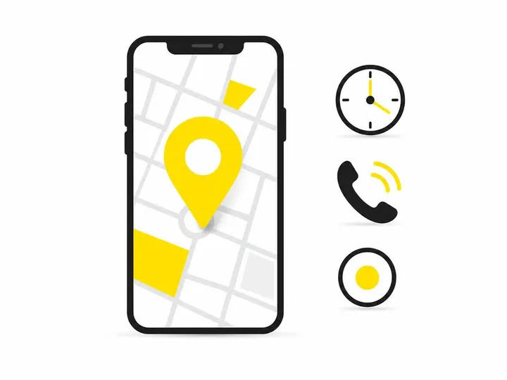
Your address, suburb and postcode should be visible on the mobile view without scrolling. Include a clickable phone number that opens the dialler on a phone. Show your opening hours clearly, including any days you're closed. Display a map or "Get directions" link that opens Google Maps or Apple Maps. Only 9 of 40 audited restaurant sites displayed an address in the initial mobile view, and none showed all three key pieces of information together.
Parking, public transport and accessibility information
If there's free or paid parking on site, say so. If there's street parking nearby, mention it. If public transport stops nearby, include the nearest bus route or train station. If your café or restaurant has wheelchair access, accessible toilets or level entry, state it clearly. These details remove reasons for a diner to hesitate or call you with questions before booking.
Mobile-First Is the Baseline, Not a Bonus
Most diners are browsing your website on their phone, often just minutes before they want to book. If your site doesn't work smoothly on mobile, you're losing the conversion at the moment it matters most.
Single-column layout, tap targets and fast loading
Use a single-column layout on mobile so diners scroll vertically through your menu and booking options without pinching or zooming. Make every button and link at least 44 by 44 pixels so they're easy to tap without missing. Minimize images, lazy-load photos only as they come into view, and test your menu loading speed on a mobile connection, not only on Wi-Fi. Guidance from the National Caterers Association, published in October 2026, recommends these elements as minimum requirements for modern restaurant websites.
How to actually test your site on mobile
Open your website on your own phone using mobile data, not Wi-Fi. Scroll through the entire page. Try tapping every button and link. Check that your menu loads in under three seconds. Zoom in and confirm that text is readable without pinching. Open your booking system and complete a test reservation from start to finish. If you find friction at any point, fix it. Do this test weekly, and ask a friend or staff member to test it on a different phone to catch issues you might miss.
A Quick Audit Checklist for Restaurant and Cafe Websites
Menu is published as HTML text, not only as a PDF or image
Every menu item has a price and a short description
Dish photos are included for most or all items
Dietary labels (V, VG, GF, N, S) are consistent and explained
Book a table button is visible in the header and after the menu
Address, phone number and opening hours are visible on mobile without scrolling
Get directions link opens Google Maps or similar
Booking system is embedded or directly linked, not hidden behind extra pages
Tap targets for all buttons and links are at least 44 by 44 pixels
Menu loads in under three seconds on mobile data
Text is readable on mobile without pinching or zooming
All information on website matches the booking system and Google Business Profile
Conclusion
Your restaurant website is a tool that diners use to make a booking decision in their final moments before they choose where to eat. Every element should be designed around answering their urgent questions: What are you serving? Do you cater to my diet? Where are you? How do I book? If your menu is in a PDF, your booking button is hard to find, or your opening hours require scrolling to see on a phone, you're losing customers to restaurants that make those details frictionless.
Start by publishing your menu as HTML text with prices, photos and consistent dietary labels. Put your booking button in the header and repeat it throughout the page. Make your address, phone number, opening hours and directions visible on mobile without scrolling. Test your site on your own phone using mobile data, not Wi-Fi. Ensure that everything on your website matches your booking system and your local search listings. The restaurants that book most tables are the ones that make it easiest for diners to say yes.
If your website isn't designed around that journey, it's worth reviewing with a team that understands how restaurants use the web. Website packages for hospitality businesses range from simple rebuilds to custom platforms that connect your menu, booking system and local search data. The cost of a better website is almost always smaller than the cost of losing bookings to restaurants that make the booking path smoother.