Best Website Layout for Small Business in Australia: Turn Visitors Into Paying Customers
Key takeaways
- Mobile-first layouts convert 37% better for local searches
- Pages loading under 3 seconds retain 53% more visitors
- Forms with 3 or fewer fields get 2.4x more completions
- Trust signals like reviews increase enquiries by 62%
- Single-page designs outperform complex navigation for service businesses
Most small business websites don't convert visitors into enquiries because their layout wastes visitor attention and makes it hard to take action. The layout is the skeleton of your whole conversion strategy: put the wrong elements in the wrong places, and even traffic won't save you. This guide shows you exactly where to position your key messages, forms, trust signals, and contact points so visitors naturally move toward picking up the phone or sending an enquiry.
Why Most Small Business Websites Fail to Convert
A visitor lands on your site. They have 10 seconds to decide whether you're worth their time. Most small business websites waste those 10 seconds on pretty images, vague headlines, or hero sections that say nothing specific about what you actually do.
The layout problems start immediately and compound. If your visitor is on mobile (which they probably are), they're hitting a layout that wasn't designed for how they actually use their phone. They can't find your contact details. Your form asks too many questions. Your testimonials are buried on page three. By the time they work out what you're offering, they've already moved on to your competitor who made it easy.
The mobile conversion gap
Australian mobile users are browsing on 4G/LTE networks, and they're impatient. A layout that looks fine on desktop can be a conversion killer on mobile. Buttons are too small to tap easily. Text is cramped. Navigation requires pinching and scrolling just to find contact information. The result: visitors bounce before they engage.
Form friction costs you enquiries
Forms are where most small businesses lose enquiries. A form with six fields might seem reasonable to you, but it's asking too much. Research consistently shows that forms with three or fewer fields convert 2.4 times better than longer ones. Every extra field you add is a reason for someone to give up and call a competitor instead.
Hidden contact information kills momentum
When a visitor is ready to contact you, they shouldn't have to hunt for your phone number. Contact details buried in a footer or hidden behind a menu tab cost you enquiries every day. The moment someone decides to get in touch is the moment your layout should make it effortless.
The Conversion-Focused Layout Structure
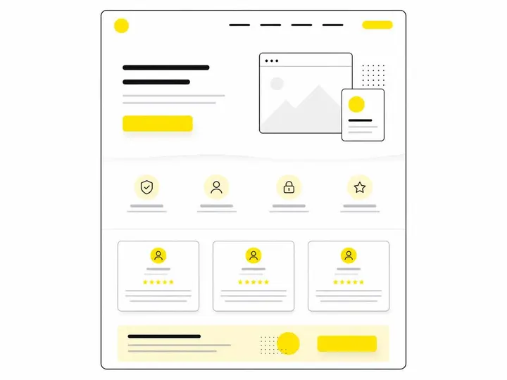
A layout that converts has a clear hierarchy: grab attention immediately, show what you do, build trust, and make taking action obvious. Here's the structure that works.
Above-the-fold essentials
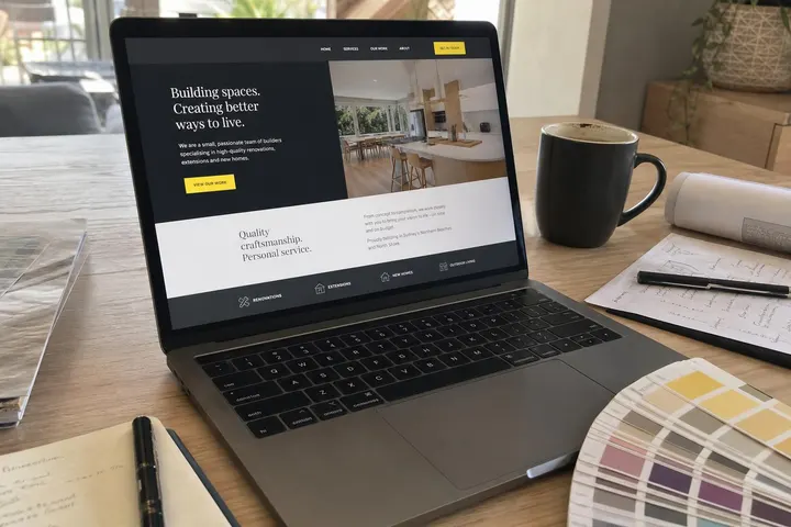
Your above-the-fold section (the part visitors see before scrolling) must include a clear headline that says what you do, who you serve, and why they should care. Skip the generic "Welcome" tagline. Instead, use something specific: "Fast Plumbing Repairs in Inner West Sydney" or "Accounting for Melbourne Tradie Businesses". Make it scannable in under three seconds.
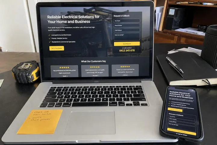
Below that headline, include one clear action button. Not five. One. Make it say what happens next: "Get a Free Quote", "Book a Consultation", or "Call Us Today". Your proven ways to increase quote requests start with removing friction from this first action button.
The service showcase section
After the hero section, show your main services or products in a simple layout. Use short descriptions paired with icons or images. Three to five services work best. More than that, and you're overwhelming the visitor. Each service should answer one question: what problem does this solve?
Trust and social proof placement
Place testimonials and customer reviews in the middle of your page, ideally after you've explained what you do but before you ask for a quote. This is where trust signals have maximum impact. Include the customer's name, their business or role, and a short quote about the result you delivered. Google reviews embedded directly on your site carry more weight than generic "testimonial" blocks.
The enquiry zone
Your main enquiry form or contact section should appear once, prominently, somewhere in the middle to lower third of your page. Don't repeat it multiple times. Make it impossible to miss, but don't force it on visitors before they understand what you offer.
Mobile-First Layout Principles That Actually Work
Designing for mobile first means building your layout for small screens, then expanding it for desktop, not the other way around. Australian mobile traffic dominates, and your layout must work for thumb navigation and fast scrolling.
Thumb-zone navigation
Mobile navigation buttons and links should sit where thumbs naturally land on a phone screen: the lower half of the display. Top-of-screen menus force users to reach, which increases bounce rates. Keep your mobile menu simple: Home, Services, About, Contact. Anything else is noise.
Tap-target sizing for Australian mobile users
Buttons and links need to be at least 44 pixels tall and wide. This sounds small, but it's the difference between a confident tap and a frustrated customer missing the button and accidentally closing your site. Every tap target should have breathing room around it.
Speed optimisation for 4G networks
Australian 4G speeds vary widely by location and network. Your layout can't rely on fast connections. Use test your site speed with Google PageSpeed Insights regularly. Remove heavy image files, lazy-load images as users scroll, and keep your code clean. A layout that loads in under three seconds on a 4G connection is non-negotiable.
Form Design That Gets More Quote Requests
Your enquiry form is your conversion machine. Every field, every option, every word matters.
The 3-field rule
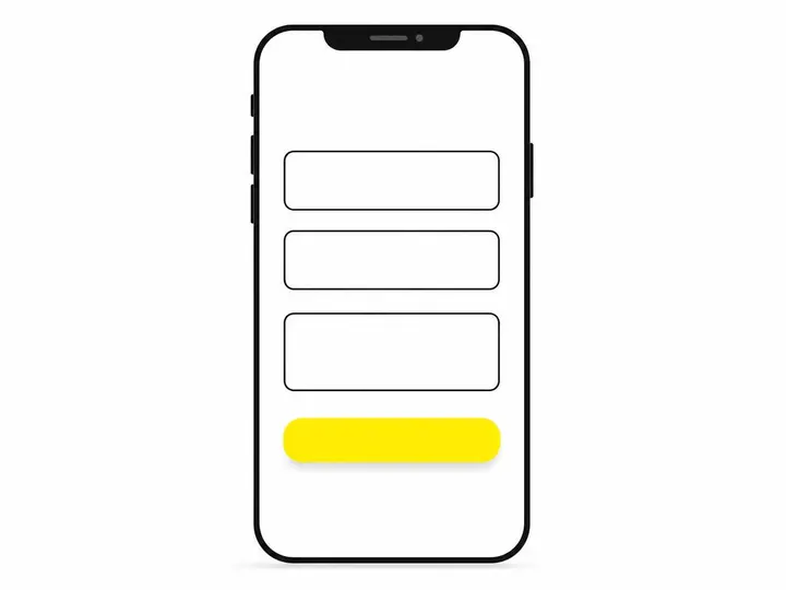
Your primary enquiry form should ask for no more than three pieces of information: name, phone or email, and a brief message about their enquiry. That's it. Get them to hit send. You can ask follow-up questions in a second email or during a phone call. Asking six questions upfront is asking them to do your work instead of making it easy for them to contact you.
Multi-step vs single-field forms
A single-field form (asking for just a phone number, for example) can work if you're confident about follow-up. Multi-step forms spread questions across several pages, which can reduce abandonment by making the form feel less overwhelming. Test both approaches: single-field converts faster, multi-step sometimes converts more visitors overall. The answer depends on your business type and follow-up process.
Phone vs email: what converts better in Australia
Australian small business owners prefer phone calls. If you offer a phone field as an option, you'll get more phone enquiries. If you only ask for email, expect slower responses and lower conversion rates. Include both options, but lead with phone. "Phone (preferred)" signals that you're serious about talking to customers quickly.
Trust Signals and Social Proof Layout
Trust signals aren't optional extras. They're load-bearing walls in your conversion structure.
Where to place testimonials for maximum impact
Testimonials convert best when they appear after visitors understand what you do, usually one-third to halfway down the page. Place them before your enquiry form, not after. Include customer name, their business type, and a real quote about the result. Video testimonials convert even better if you have them, but authentic written ones beat polished marketing copy every time.
Displaying credentials and licences
Tradie websites especially need visible proof of credentials. Plumbers need their plumbing licence number displayed. Electricians need their electrical contractor registration. Accountants need their professional body membership. Place these in a small section near your contact details or in your footer. They're not glamorous, but they're essential for trust. Customers checking credentials before calling is normal; make it easy.
Google reviews integration
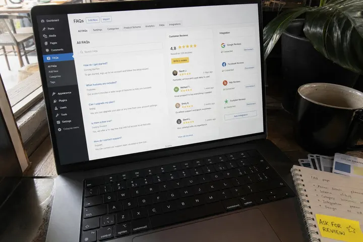
Embed your Google reviews directly on your site. Display your star rating prominently and show 5 to 10 of your most recent reviews. Google reviews carry more weight than testimonials because they're third-party verified. If your Google review rating isn't visible on your website, you're wasting free trust signals.
Single-Page vs Multi-Page Layouts
Should your website be one long page or multiple pages? The answer depends on your business type and what your customers are actually searching for.
When single-page works best
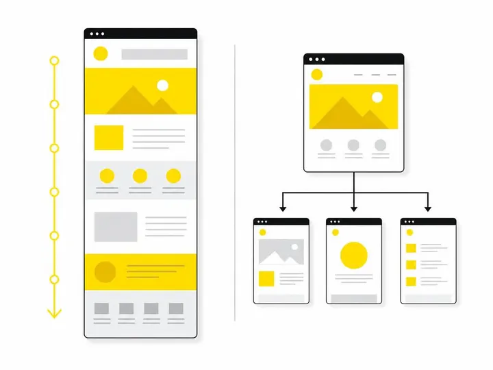
Single-page layouts work well for service businesses with one main service or a tight local focus. A plumber serving one suburb, an accountant offering basic tax services, or a cleaner with a simple service menu all benefit from a single-page design. Everything is above the scroll, and visitors get from headline to contact button without clicking around.
Service businesses vs product businesses
Service businesses often work well as single-page sites. Product businesses with multiple categories or SKUs need multi-page layouts. Trade service businesses benefit from a homepage layout for tradies that keeps the main message clear while offering separate pages for different services.
Navigation patterns for local search traffic
If most of your enquiries come from local Google search, a simple multi-page layout works better than a single page. People searching for "plumber near me" then "emergency plumber" then "tap repairs" are looking for specific answers on specific pages. Build pages for those specific searches. Google Australia mobile search behaviour research shows that customers navigate through multiple pages before deciding to call.
Common Layout Mistakes Australian Small Businesses Make
These are the layout errors that cost real enquiries.
Carousel sliders that kill conversion
Auto-playing image carousels on your homepage look impressive but they kill conversion. Most visitors don't wait for the second image to load. They bounce. If you're using a slider to show multiple messages, you're saying everything equally, which means nothing stands out. Use a static hero image with one clear message instead. If you need to show multiple products or services, use a simple grid, not a slider.
Vague hero sections
A hero section that says "Welcome to Our Site" or "Quality Service, Competitive Prices" tells visitors nothing useful. They still don't know what you do or if you're right for them. Your hero section headline must answer one question in under 10 seconds: what problem do you solve, and for whom? "Blocked Drain Fixed in 2 Hours in South Melbourne" beats "Trusted Plumbing Solutions" every single time.
Too many choices, not enough direction
A homepage with 10 different services, 15 product categories, and menu options everywhere is confusing. Visitors don't know where to start. Confusion leads to bounce. Limit homepage choices to three to five main options. Guide visitors down one path: understand the problem, see the solution, take action. Everything else can be secondary navigation or separate pages.
Conclusion
The best small business website layout is one that matches how your customers actually behave online. They arrive on mobile, they have 10 seconds to decide if you're relevant, and they want to take action fast. Your layout must serve that behaviour, not fight it.
Start with a clear above-the-fold message, show your main services, build trust with testimonials and credentials, and make your contact form painless. Test everything on mobile. Remove friction. Stop trying to impress; start trying to convert. If you're unsure about your current site, check what website pricing in Australia actually covers and whether you're getting a layout designed for conversion or just a pretty brochure. A better layout is the fastest, cheapest way to turn your existing traffic into more enquiries.