Website Footer Design for Australian Small Businesses: What to Include
On this page 9 sections
Key takeaways
- Include tappable contact details, phone, email, address in every footer
- Link to your privacy policy and any relevant terms from the footer
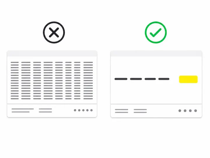
- State your service area clearly but link to a dedicated page rather than listing every suburb
- Avoid stuffing the footer with keyword-heavy links it harms usability and can look manipulative to Google
- Test your footer on a mobile screen, stack columns logically and keep text readable
Your website footer is often the last place visitors look before they decide whether to call, email or leave. Most small business owners ignore it, treating it as a dumping ground for links and legal text. In reality, a well-designed footer can answer critical questions, build trust and turn a browsing visitor into an enquiry. This guide shows you what to include, what to leave out, and how to make sure your footer actually helps your bottom line.
Why Your Footer Matters More Than You Think
The footer as a predictable destination
Visitors and search engines know where to find key information on a website. The footer is one of the most predictable locations for contact details, policies and trusted links. According to research from the Feedback Studios guide to website footer essentials (updated November 2026), the footer acts as a fallback destination when a visitor cannot find what they need in the main content or header. This is especially true for phone numbers, opening hours, privacy policies and service information.
Many Australian small business owners repeat their contact details in the header, sidebar and footer. That might sound redundant, but it is not. If a visitor scrolls to the bottom of your page without finding what they need, they should not have to search the entire site again to call you. The footer serves as a reliable checkpoint.
What visitors look for at the bottom of the page
Research from Nielsen Norman Group confirms that users expect certain information at the bottom of a page: business name, contact phone number, email address, physical location or service area, opening hours, links to policies, and social media profiles. When these details are absent or hidden, visitors assume the business is either not serious or not easy to reach. For a small business in 2026, both assumptions hurt your enquiry rate.
The Core Footer Checklist for Australian Small Businesses
Business name, logo and short positioning statement
Your footer should include your business name and optionally a small logo or icon. Many visitors will land on a deep page of your site (via search or a link) and may not have seen your homepage. A quick logo or name reminds them who you are. Keep any positioning statement to one short line: for example, "Sydney plumbing and drain specialists" or "Hairdressing and beauty treatments in Canberra."
Phone number, email and physical address or service area
This is non-negotiable. Include at least one phone number and a business email address that you monitor regularly. If you operate from a fixed location, include your street address. If you are mobile or service multiple suburbs, state your general location or link to a dedicated service area page instead of listing dozens of suburbs in the footer (more on this below).
Opening hours
A visitor may land on your footer at 6 p.m. on a Friday and want to know whether you are open Monday morning. Include your standard opening hours in a clear format. If your hours vary by day, show that variation. If you offer emergency or after-hours services, note that too. It takes 15 seconds to add and saves you voicemails from people calling outside your hours.
Primary services and key page links
Group your main service categories or key page links under a short heading such as "Services" or "More." For a plumbing business, this might be "Drain Cleaning," "Leaks and Repairs," "New Installations." For a marketing agency, "SEO Services," "Web Design," "Digital Strategy." Keep the list to five to seven items; anything longer should move to a dedicated page. This approach helps both visitors and search engines understand your core offerings without cluttering the footer.
Trust Signals and Compliance Information
ABN, licences and professional registrations
If your industry requires a licence or registration (plumbing, electrical, finance, real estate, health services), include it in the footer. You do not need to write "ABN: 12345678901" in large text, but a mention like "ABN 12345678901" or "Licensed electrician, Electrical Contractors Board NSW" builds instant credibility. Do the same for professional memberships: "Member of the Master Builders Association" or "Insured through [Provider]." These are genuine trust signals that belong in the footer.
Privacy policy and terms
Every website that collects personal information or uses analytics needs a privacy policy. Every e-commerce site needs terms and conditions. Link to these documents from the footer, not buried in a pop-up. If you are using tracking cookies or consent tools, make sure your cookie consent guide for Australian businesses is easy to find and revisit. Current best practice in 2026 includes an accessible way for visitors to review or withdraw consent from the footer.
When to include disclaimers
Include a brief disclaimer only if it is genuinely necessary. Financial services, health advice, legal services and certain trades may need a statement such as "This information is general and not personal advice. Seek professional advice before acting." Do not add disclaimers just to cover yourself; they add clutter and suggest you are not confident in your service.
Awards and reviews: what is genuine and what is not
If your business has won an award, been featured in a publication or achieved a genuine certification, mention it. "Google Partner 2025" or "Winner of the Sydney Business Awards, Hospitality Category" builds trust. Do not include vanity badges that mean nothing (like "5-star rated" without context, or badges you paid a third party to award). Visitors can spot these easily, and they undermine your credibility. For real trust signals on your website, stick to measurable achievements and verified testimonials.
Service Areas: How to Do It Without Stuffing Keywords
State your area clearly in plain language
If you service a region, be specific but concise. Instead of listing "Plumbing in Manly, Freshwater, Curl Curl, Dee Why, Collaroy, Narrabeen, Mona Vale, Avalon Beach, Barrenjoey, Palm Beach and surrounds," write "Northern Beaches, Sydney" or "Sydney and Central Coast." This is clearer and easier to read. If you service a whole state, say so: "We deliver across Victoria."
If you have a large service area and need to show coverage, avoid keyword-stuffing lists in the footer. Instead, create a dedicated service area page and link to it from the footer. This keeps the footer clean, gives you a proper page for detailed local information, and lets you avoid the SEO black hat practice of repeating suburb names across every page.
Designing for Mobile Enquiries
Tappable phone numbers and email links
On mobile, your phone number must be a clickable link that opens the phone dialler or voicemail. Use the HTML format `02 1234 5678`. The same applies to email: `[email protected]`. Test these on your own phone to confirm they work. A small friction point here can cost you half your mobile enquiries.
Stacking column order on small screens
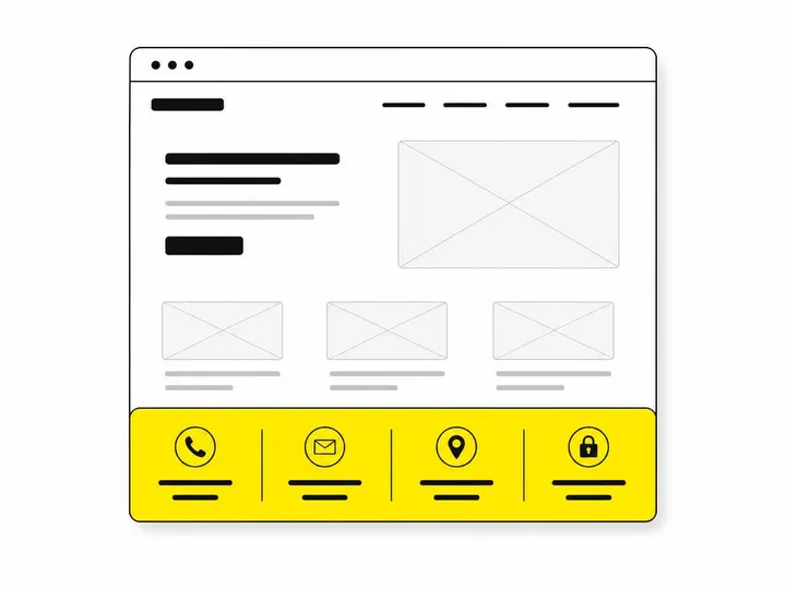
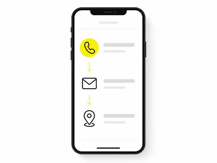
On desktop, your footer might display in three or four columns. On mobile website tips for small businesses, these should stack into a single column. Decide the order carefully: contact details first, then services or links, then policies. This order ensures that the most important information (how to reach you) appears first on a small screen without the visitor having to scroll past everything else.
Contrast, font size and touch targets
Footer text is often smaller than body text, but it should not be tiny. Use a minimum of 14 pixels for body text and 16 pixels for links. Ensure sufficient colour contrast between text and background: a light grey text on a dark background can be difficult to read. Links should be large enough to tap comfortably on a phone (at least 44 by 44 pixels is the standard). Test your footer on a real mobile device, not just a browser preview.
Accessibility in Your Footer
Semantic footer landmark and labelled navigation
Use the HTML `
` semantic landmark to wrap your footer content. Inside, use `` elements with descriptive labels such as `aria-label="Services"` or `aria-label="Company information"` to help users of screen readers understand the structure. This is not complex and costs nothing, but it makes your footer navigable for people using assistive technology. See our guide on website accessibility for Australian small businesses for full implementation details.
Visible focus states and keyboard access
Every link in your footer should be keyboard-accessible and have a visible focus indicator (a border, outline or colour change). Avoid using `outline: none;` in your CSS. Test your footer by tabbing through with the keyboard: all links should be reachable and clearly highlighted.
Accessible social media icons
If you include social media icons in the footer, give each one a descriptive label. Instead of a bare Facebook icon, use `` or add visible text. Screen reader users must know where the link goes.
What to Leave Out of Your Footer
Keyword-stuffed location or service lists
Do not create a hidden list of suburbs or services in your footer just to rank for those keywords. Google and other search engines can see this and penalise it. The Ritner Digital's website footer checklist confirms that sitewide footer links repeated across hundreds of pages for ranking purposes are a red flag. Use your footer for genuine navigation and information, not SEO manipulation.
Unsupported claims and vanity badges
Do not include claims you cannot back up. "Rated the best in Australia" without evidence, generic badges, or reviews you have not verified look unprofessional. If you have real testimonials or verified ratings, save those for a dedicated page.
Outdated information
Review your footer once a quarter. Outdated opening hours, phone numbers or addresses confuse visitors and damage your credibility. If something is in your footer, keep it current.
A Simple Way to Measure Footer Performance
Tracking clicks on phone, email and direction links
Set up how to improve website conversions by tracking footer enquiry actions in Google Analytics. Create event tracking for clicks on your phone number, email address, "Get Directions" link and contact form button. In Google Analytics 4, this takes a few minutes and a small snippet of code. Over two to three months, you will see how many visitors use your footer to contact you.
Reviewing footer-assisted conversions in analytics
In Analytics, create a segment for "Footer Visitors" or add a filter to see which pages in your funnel include footer interactions. Compare the conversion rate for visitors who click your footer phone link versus those who do not. This data tells you whether your footer design is actually working or whether it needs adjustment. If almost no one clicks your footer phone number, the text is too small, the colour is wrong, or the number is hard to read.
Conclusion
Your website footer is not a legal necessity or an afterthought. It is a predictable place where visitors expect to find contact details, service information, opening hours, and trust signals. A well-designed footer answers questions, builds confidence and creates a clear path to an enquiry. At minimum, include your business name, phone number, email, location or service area, opening hours, primary services, and links to your privacy policy and key pages. On mobile, make sure phone numbers are tappable and the layout is readable. Test the footer yourself on a small screen and in a screen reader.
The best footer serves your visitor first and your search ranking second. That means clarity over keyword density, accessibility over decoration, and current information over evergreen claims. If you are unsure what your small business needs, start with our website packages for small business, which include footer design and mobile testing as standard. Then measure what actually works: track clicks, watch your analytics, and refine. A small investment in footer design pays off in clarity, trust and enquiries.
Frequently asked questions
What should I put in my website footer as a small business in Australia?
Does my ABN need to be on my website?
Should I list every suburb I service in my website footer?
How do I make my footer mobile-friendly?
Does my website footer affect SEO?
What is a semantic footer landmark and do I need one?
<footer> element, which tells browsers and assistive technologies like screen readers where the page-level footer begins. Using it correctly along with labelled navigation groups, adequate colour contrast and visible keyboard focus states — helps users of assistive technology navigate your site and aligns with Australian accessibility expectations under WCAG guidelines.