Website Pop-Ups for Australian Small Businesses: When They Help and When They Hurt
On this page 7 sections
Key takeaways
- Delay pop-ups until visitors have engaged with your page content
- Never cover the full screen on mobile, keep content visible
- Match the offer to the page, a quote prompt on a services page, a newsletter prompt on a blog
- Exit-intent triggers perform better than instant interruptions
- Measure bookings and calls, not just email sign-ups, to judge real impact
Pop-ups can help you capture leads and boost sales, but they can also frustrate visitors and damage your Google rankings if you get the timing and design wrong. The difference between a pop-up that converts and one that annoys comes down to context, intent and respect for the person visiting your site.
What a Pop-Up Actually Does to Your Visitor
A pop-up is an interruption by design. The question is whether it interrupts at a moment when your visitor is ready to hear from you, or whether it blocks their path to the content they came to find.
The difference between a prompt and an interruption
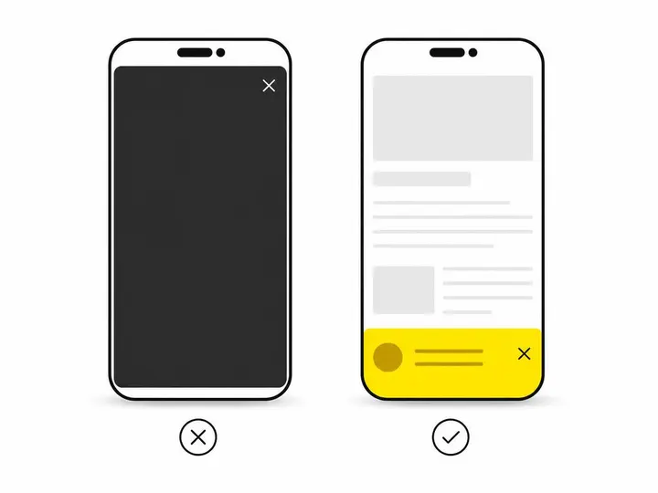
There's a meaningful distinction between a contained prompt and an intrusive overlay. A prompt sits in a corner, appears after you've read a few paragraphs, or slides in with a clear close button. An interruption is a full-screen modal that forces you to either engage or click away before you can see what you came for. On mobile, the difference feels enormous.
A small banner at the bottom of your screen asking for an email address while you're already reading feels like a gentle nudge. A full-screen overlay blocking 80% of your phone screen on arrival feels like a sales pitch before you even know if the business is relevant to you. Google Search Central guidance is explicit on this point: don't cover the entire page with an interstitial, especially if it prevents users from seeing the content they came to find.
Why mobile matters most in 2027
Mobile traffic now dominates for most Australian small businesses. A pop-up that looks manageable on a desktop monitor can monopolise a phone screen and trigger an instant back button. Recent 2026 data shows that fixed banners, cookie notices and pop-ups together cover a median of 7.1% of the first screen on mobile devices, but critically, 8.5% of homepages cover more than a quarter of the screen and 4.1% cover more than half.
Google's guidance on intrusive interstitials specifically targets mobile-first indexing. If your pop-up obscures content on a phone, search engines struggle to understand what your page is about, and your rankings can suffer. This isn't an automatic penalty; it's a factor that can contribute to poorer search performance.
When Pop-Ups Help Small Business Conversions
Pop-ups are not inherently bad for business. The key is matching the prompt to the visitor's intent at that exact moment.
Exit-intent offers and discount prompts
An exit-intent pop-up triggers when someone's mouse moves toward the back button or when they've spent time on a page without converting. This is one of the most effective uses because the visitor is already leaving; a last-minute offer can win them back. Industry benchmarks suggest exit-intent prompts convert at roughly 1% to 10% of triggered sessions, depending on the offer and audience, though this varies widely by context.
For a plumber, electrician, or service provider, an exit-intent prompt might say, "Before you go, book a free site visit or get a same-week quote." For a retail business, a discount code or free delivery offer can work. The timing is right because you're not interrupting someone reading; you're catching someone who has already decided to leave.
Booking and quote prompts on high-intent pages
If a visitor has spent time on your "Services" page or a specific product page, they're closer to a decision. A compact pop-up or slide-in prompt offering a booking link or quote form matches their intent. They're already thinking about taking action; the prompt removes friction by putting the next step directly in front of them.
This works better than a generic newsletter sign-up on these pages. Context matters. A visitor reading about your accounting services doesn't want to be asked to download your blog newsletter; they want to book a consultation.
Lead magnets on blog and resource pages
Blog readers and people downloading resources are actively seeking information. After they've read two or three paragraphs, offering a downloadable guide, checklist or template relevant to that article is often welcome. Lead magnet examples for Australian small businesses include email templates, pricing guides, checklists and comparison worksheets.
The prompt should be specific: "Download our 7-point website audit checklist" converts better than "Join our mailing list." You're offering real value, not just adding them to a list.
When Pop-Ups Hurt Your Business
Timing, frequency and design choices determine whether a pop-up helps or damages your reputation and search performance.
Triggering immediately on arrival from Google search
A visitor lands on your site from Google search and before they can read a single word, a pop-up covers their screen. They didn't come to see a pop-up; they came to find information. An immediate full-screen prompt signals that you value your email list more than answering their question. Most will close it and go to your competitor instead.
From a Google perspective, if the interstitial prevents Googlebot from seeing your main content, it can affect your rankings. From a user perspective, it erodes trust before your business has had a chance to prove itself.
Full-screen overlays on mobile
A modal that works on desktop becomes a wall on mobile. If your pop-up doesn't resize responsively or if the close button is tiny, mobile visitors will abandon your site. A mobile-friendly website should also mean mobile-friendly prompts. Test every pop-up on actual phones, not just in the browser's mobile emulation.
Showing the same prompt to every visitor, every visit
Repeating the same pop-up to the same person every time they visit damages trust and annoys them. Use tools that suppress the prompt after a visitor has closed it, seen it multiple times, or already converted. If someone has already given you their email address, don't keep asking for it.
Segmentation also matters. A new visitor might see an "Get 15% off" prompt, while someone who has visited five times might see a "Book a consultation" prompt instead. Blanket prompts ignore user behaviour and waste conversion opportunities.
Google's Guidance and What It Means for Your SEO
Google doesn't ban all pop-ups, but it does penalise intrusive ones, particularly on mobile and in search results.
What Google actually says about intrusive interstitials
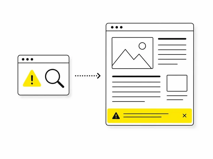
According to Google Search Central guidance on intrusive interstitials, you should not cover the entire page with a modal, especially when it forces users to move to a separate page or scroll down to reach the main content. Google recommends a small container that keeps the page usable and provides a clear, obvious close control.
The mechanism isn't an automatic ranking drop. Instead, intrusive experiences can make it harder for search engines to understand your page, and that reduced understanding can contribute to poorer search performance over time. A slide-in banner or a small dismissible dialog is far less risky than a full-screen overlay.
Legally required notices are treated differently
Cookie consent notices, age verification prompts, and other legally required disclosures receive different treatment. Google expects these to be present and doesn't penalise their use. However, even legal notices should be designed to minimise page obstruction. A clear banner at the top is preferable to a modal blocking half the screen.
A Practical Checklist Before You Add a Pop-Up
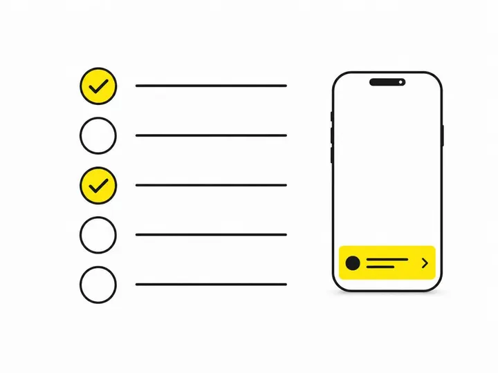
Before you launch a pop-up, work through these five questions to avoid common mistakes and unnecessary SEO risk.
Five questions to ask before you go live
Does it appear after engagement, not on arrival? Wait for the visitor to read at least 10 to 15 seconds of content before showing the prompt. Better yet, use exit-intent or time-based triggers.
Is it dismissible with one clear click? The close button must be obvious, not hidden in a corner or disguised as a link. Mobile users must be able to close it with their thumb.
Does it match the page context? A newsletter sign-up doesn't belong on a services page; a booking prompt does. Match the prompt to the visitor's intent on that page.
Will it be suppressed after the visitor closes it or converts? Set rules so the same person doesn't see it again within at least 30 days, or never if they've already given you their email.
Does it work responsively on mobile? Test on an iPhone and Android phone. If the close button is smaller than 44 by 44 pixels, make it bigger.
Less intrusive alternatives worth testing first
Before committing to a full-screen pop-up, test these gentler options. A sticky banner that slides in from the bottom takes up less space. An inline call-to-action within the page content can convert without interrupting. A well-designed page layout for small business can place a prominent signup form or booking link in the natural flow of content. Many businesses find that a simple, persistent sidebar or footer form converts as well as a pop-up without the UX cost.
How to Measure Whether Your Pop-Up Is Actually Working
Treat your pop-up as a business experiment, not a set-and-forget feature. Measure outcomes that matter to your business, not just engagement metrics.
Look beyond email sign-ups
A pop-up that collects 50 email addresses a week sounds successful until you compare it to the rest of your business. Did phone enquiries drop? Did booking form submissions decrease? Did bounce rate increase? Email addresses are only valuable if those people actually convert to customers.
Track these metrics before and after you add the pop-up: bounce rate, time on page, conversion rate (calls, bookings, purchases), and assisted conversions (visits that included a pop-up interaction but converted on a later page). If your pop-up is working, you should see an improvement in business outcomes, not just a spike in email captures.
When to turn it off
If bounce rate increases, time on page decreases, or qualified enquiries drop after adding a pop-up, disable it. Test a different timing, offer or design. Some businesses discover that a pop-up hurts more than it helps because it interrupts the user journey without adding value aligned to the visitor's intent.
Run each experiment for at least two weeks and ensure you're comparing like-for-like traffic sources. A pop-up tested during low-traffic days won't give you reliable data.
Conclusion
Pop-ups work best when they're contextual, well-timed and respectful. An exit-intent discount, a booking prompt on a high-intent page, or a lead magnet on a blog article can genuinely improve conversions. A full-screen modal on arrival, a repeated prompt to the same visitor, or an overlay that blocks content on mobile will damage trust, annoy people and risk your search rankings.
The distinction between helpful and harmful comes down to whether you're interrupting someone or supporting their next step. Test your pop-up on actual mobile devices, measure business outcomes not just clicks, and be willing to remove it if it's hurting your metrics. Improving your website conversion rate isn't just about adding more prompts; it's about removing friction and matching the visitor's intent at every step.
If you're unsure whether your current site is optimised for conversions or designed with mobile in mind, start there before adding any pop-up. A poorly designed page with a pop-up is worse than a poorly designed page without one.