How to Build a Website Comparison Page That Reduces Buyer Confusion

On this page 8 sections
Key takeaways
- A comparison page is a decision tool, not a second service page
- Use the same criteria for every option so comparisons are fair
- A 'best for' structure beats declaring one universal winner
- Put the recommendation near the top, then follow with the table
- Add a 'last reviewed' date and update pricing when things change
- Design for both mobile and desktop. Australian traffic is split roughly 45/55
A website comparison page helps a buyer choose between your options without having to ring you and ask, "So what's actually the difference?" Done well, it cuts confusion, filters out poor-fit enquiries and sends you better leads. Here's how to plan, build and maintain one that people trust.
What does a comparison page actually do?
A comparison page helps a visitor choose between clearly defined options. A service page, by contrast, explains what you offer and why they should pick you.
The difference between a service page and a comparison page
A service page answers "What do you do?" A comparison page answers "Which one is right for me?" It sits later in the buying journey, when someone already likes you but can't decide between, say, your Standard and Premium bookkeeping packages. If you're unsure where landing pages fit into this, our guide on how service pages and landing pages differ covers it. Keeping these pages separate matters because two pages chasing the same search compete with each other and leave visitors unsure where to go.
When a comparison page makes sense for a small business
- You sell tiered packages, like our website packages or a cleaning business with weekly and fortnightly plans.
- You offer different delivery methods, such as in-person versus online coaching.
- Buyers weigh you against an alternative approach, like hiring an accountant versus using DIY software.
- Your enquiries keep revealing the same confusion.
Plan the page before you build it
The best comparison pages are planned around the decision your customer is trying to make, not the option you most want to sell.
Choose what you are comparing
Comparing your own packages or delivery options is the simplest and safest choice. Comparing named competitors is riskier, because every claim you make about another business must be truthful and verifiable.
Pick the criteria that matter to Australian buyers
Use the same criteria for every option. Useful ones include:
- Total price, stating clearly whether it includes GST
- Contract length and cancellation terms
- What's included and what isn't
- Turnaround time
- Local support and contact hours
- Warranty or guarantee
- Service area
- Suitability by business size
Decide on a "best for" structure rather than a single winner
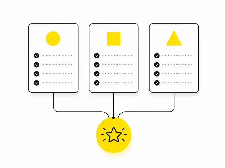
Label each option by who it suits: best for lowest upfront cost, best for ongoing support, best for owners who want it fully managed. Admitting where another option is stronger is what makes people believe the rest of the page.
How should a comparison page be structured?
Put a short recommendation at the top, follow it with the comparison table, then explain the differences and back them up with evidence.
Lead with a short recommendation
Two or three sentences is enough: "Most sole traders choose Basic. Pick Premium if you have staff and need payroll." Busy visitors can stop there.
Build a responsive HTML comparison table
Use a real HTML comparison table with proper headers, not a screenshot or image. Screen readers, search engines and AI tools can all read it. Aim for four to eight rows so it stays scannable.
Explain the differences below the table
Tables show what differs. The text underneath explains why it matters, such as what "priority support" actually means in response times.
Add evidence to support your claims
Include screenshots of what's delivered, a short process outline, substantiated case study results and a few FAQs. Avoid "cheapest", "best" or "No. 1" unless you can prove it.
Design and accessibility considerations
Your comparison table needs to be readable on any screen and usable by everyone, including people with disability or low digital confidence.
Make the table work on both mobile and desktop
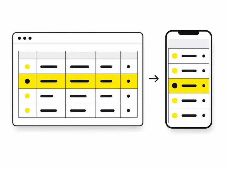
Use responsive web design so the table becomes stacked cards on phones while staying a full table on desktop. StatCounter data for July 2026 put mobile at 44.7% of Australian web traffic and desktop at 55.3%, and the ACMA Communications and Media in Australia 2025 report found 95% of adults used a mobile phone to go online in 2024. Test both. Our tips on making your website mobile-friendly go deeper.
Meet basic accessibility standards
WCAG 2.2 Level AA is the practical benchmark. That means marked-up table headers, keyboard navigation, strong contrast and text that scales. The WCAG 2.2 quick reference guide lists each requirement. The 2025 Australian Digital Inclusion Index found around one in five Australians remain digitally excluded, so plain language matters too. See our guide to website accessibility for Australian small business.
Avoid relying on colour or icons alone
Pair ticks and crosses with words like "Included" or "Not included". Don't hide key details in hover tooltips, which don't work on touchscreens.
How do you optimise a comparison page for Google and AI tools?
Target comparison intent with direct answers, descriptive headings and your own first-hand knowledge, rather than repeating what your service pages already say.
Target comparison intent without duplicating service pages
Comparison intent shows up in searches like "Xero vs MYOB bookkeeping" or "which cleaning plan do I need". Your service page targets "bookkeeper Parramatta". Link between them instead of copying content across.
Structure content so AI tools can read and surface it
Google AI Overviews increasingly pull from clearly structured pages. A Google and Ipsos summary from July 2026 found more than 70% of 366 Australian shoppers who used these features said they helped them decide faster, though that's a limited sample. Google's people-first content guidance still rewards original expertise over generic summaries, so include what only you know.
What to include in your page title, headings and meta description
- Title: name the options, such as "Basic vs Premium Bookkeeping: Which Suits You?"
- Headings: phrase some as the questions buyers ask.
- Meta description: state who each option suits in one line.
How do you keep a comparison page accurate and legally safe?
Date the page, record the source of every claim and review it on a fixed schedule so everything stays truthful and verifiable.
Add a "last reviewed" date
Show it near the top. It tells visitors and search engines the pricing is current.
Record the source of any competitor or market claims
Keep a simple spreadsheet listing each claim, its source, the date checked and a screenshot. Separate facts from opinion on the page itself. Misleading comparisons can breach Australian Consumer Law.
Set a review schedule
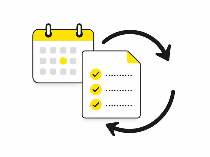
Review quarterly, and immediately whenever your prices, inclusions or policies change. Assign one person to own it.
Calls to action and lead qualification
Your call to action should match how close the visitor is to deciding, and your enquiry form should ask which options they're weighing up.
Match the CTA to where the visitor is in their decision
Put a specific prompt under each option, such as "Ask about Premium". For visitors still browsing, offer a lighter step like a checklist. Australia Post's 2026 eCommerce report shows Australians spent $82.6 billion online in 2025, so your buyers are used to comparing before committing. More on getting more enquiries from your website.
Use an enquiry form that asks what they are comparing
Add a dropdown: "Which options are you considering?" You'll know their needs before you call, and conversations start further along.
Conclusion
A good website comparison page is a decision tool, not another service page. Use consistent criteria, a "best for" structure, a real HTML table that works on mobile and desktop, and honest evidence. Meet WCAG 2.2 Level AA, write for comparison intent and keep every claim dated and sourced.
Start by listing the three questions customers ask most when choosing between your options, then build your table around those. If you'd like help shaping the page, our team handles small business web design with this kind of decision-focused structure built in.